

There’s a pair of bright orange heels in the window and you’ve walked past them three times this week. You like them. You have no idea what you’d wear them with, and you suspect the answer is “one outfit, twice, then never again.”
That hesitation is correct, and it’s also the reason most colorful heels for women end up at the back of the wardrobe. The problem isn’t the color. It’s that people buy the loudest possible version of it, in the shape they already own in black, and then discover that a statement shoe needs a quieter outfit than they expected.
So the useful question isn’t “which color do I like?” It’s “which color will I still want to wear on a Tuesday in March?” Those are different questions, and the second one has a much better answer.
Pick the color from something you already wear, not from the shelf
Go to your wardrobe before you go to the shop. Find the garment you wear most, the one that’s washed 40 times and still gets pulled out. Look at its color. That’s your palette, and a heel in that family will get worn because you already know how it fits into your week.
This sounds obvious and almost nobody does it. The result is a shelf full of statement shoes that match a dress bought for one wedding.
The practical version: if you live in navy, buy blue heels. If your wardrobe is mostly cream and camel, buy a warm red. If it’s black and gray, almost any single bright color works, because you already own the neutral half of the outfit.
The reverse also holds. If your wardrobe is already full of prints, a colorful heel makes the outfit louder, not better. In that case you want texture instead: suede, patent, a woven finish, all in a neutral color. Shine reads as interest without adding a second color.
Do a two-minute check before you pay. Hold the shoe against three things you wear often. If it works with two, buy it. If it works with one, it’s a costume piece, and costume pieces are fine as long as you know that’s what you’re buying.
There’s a second version of this test that catches more bad buys. Take a photo of the shoe next to your three most-worn outfits, then look at the pictures the next morning rather than in the shop. Shop lighting flatters bright colors and your phone screen doesn’t. Half the colorful heels for women that look restrained under a spotlight look like a party trick in daylight, and the photo tells you which one you’re holding.
Bright isn’t the same as saturated, and the difference decides whether they look cheap
Color has more than one dial. Hue is the family, so red versus green. Saturation is how pure it is. Lightness is how close it sits to white or black. Two shoes can both be “bright pink” and behave completely differently, because one is a pure saturated pink and the other is a soft pink with a lot of white mixed in. The basics of color theory cover the three dials properly if you want the vocabulary.
Saturated colors at full strength look expensive in small doses and cheap in large ones. A saturated heel is a small dose. That’s why a vivid shoe often works when the same color in a dress wouldn’t.
The catch is the finish. A saturated color needs a clean surface to look deliberate. On a scuffed, matte synthetic upper, bright dye looks like painted plastic. On a smooth leather or a satin, the same color looks like it came from a proper shoe shop. The difference between colorfulness and saturation is worth knowing here, mostly so you stop calling every strong color “bright”.
Where people go wrong: choosing a color that’s both saturated and light, like a pale acid yellow. Those tones sit close to highlighter territory and almost nothing in a normal wardrobe supports them. Darker and more saturated is safer. So is lighter and less saturated. The middle of both dials is where the trouble is.
Which colors survive a real week
Some colors are easy and some need planning, and it has nothing to do with how much you like them.
Easy, in rough order: deep red, forest green, cobalt blue, mustard, burgundy. These all sit close enough to a neutral that they behave like one. You can wear deep red heels with denim, with black, with gray, with navy, and none of it looks like a mistake.
Harder: hot pink, orange, electric turquoise, lime. These are wonderful in photographs and demanding in real life, because they need a mostly neutral outfit and they clash with most prints. If you want one, buy it in a style you’ll wear to occasions, not to work.
Hardest: pastels. A pale mint or baby blue heel shows every scuff, every drop of rain, and every mark from a car door. They also look tired fast. Pale colors are not more forgiving just because they’re soft.
There’s a shortcut here that costs nothing. Look at the sole edge of a colored pair in daylight, not shop light. If the color looks flat and slightly gray at the edge, the dye is surface-level and will wear off at the flex points. If it stays rich at the edge, the leather is dyed through and it’ll last.
One more thing worth knowing: bright shoes make your feet look bigger, and that’s not a flaw you need to correct. A colored heel at the end of a long leg reads as a punctuation mark. The people who look best in colorful heels for women are usually the ones who stopped trying to minimize them.
Loud on purpose or loud by accident: how to tell which pair you’re buying
A colorful heel is a design decision. Some shoes commit to it and some just happen to be red. You can spot the difference in about ten seconds.
- Committed: the color runs through the lining and the sole. The heel shape suits the color, so a sharp pointed toe in a bright shade.
- Committed: no extra hardware. No buckles, no studs, no contrast stitching competing with the color.
- Accidental: a bright upper on a beige plastic sole, which is where the cheapness actually lives.
- Accidental: color plus a print plus a bow. Three ideas in one shoe.
That beige sole detail matters more than people think. It’s the first thing you see from behind and the last thing anyone notices in a photograph, and a bright shoe sitting on an unfinished sole reads as a party favour.
If you’re buying one pair of colorful heels for women this year, buy the committed kind in a color close to your wardrobe, and wear them until the novelty wears off. It usually doesn’t.
Colored pairs run small, and there’s a physical reason
Dyeing and coating processes stiffen leather slightly. Bright colors usually need more coating than black does, because black hides unevenness and a vivid shade doesn’t. The result is that a colored pair often feels half a size tighter than the same style in black, especially across the toes.
So try before you assume your size. If you’re ordering online, order the color you want and a black pair in the same style, keep the one that fits, and return the other. Most shops allow it and it beats a second round of postage.
Break-in takes longer too. Where a black pair might soften in three wears, a coated colored pair can take eight or ten. Use a shoe tree between wears and don’t force it with heat. Heat plus coating is how you get a crease that never comes out.
Wide feet should go up a half size rather than hoping the color stretches. It won’t. The square toe silhouette that gives wide forefeet room is available in most bright shades now, and it solves the problem at the source.
The honest downside: scuffs on color have no cover-up
Black shoes can be polished. Brown shoes can be waxed. A fuchsia shoe with a scuff on the toe is a fuchsia shoe with a gray mark on the toe, and there is no product that fixes it invisibly.
That’s the real cost of the category, and it’s why I’d spend more on a color I plan to wear weekly than on one I’ll wear four times. On cheap bright pairs the scuff arrives in week two, because the coating is thin. On better ones you’ll get a season or two.
You can limit the damage. Keep them out of the rotating pile you wear in the rain. Wipe the toe after every wear with a dry cloth, because grit is what grinds the finish off. And store them separately, since bright dye can transfer onto a pale shoe pressed against it in a bag.
If a scuff has already happened, a matching cream polish in the closest shade will hide it from a meter away. Nothing hides it from 30cm. Accept that and the shoes stay wearable.
There’s one workaround that sounds silly and works: buy two pairs of the cheap version instead of one expensive pair, and treat the second as spare. For bright shades that scuff fast, two £35 pairs outlast one £90 pair and you never have to care about the mark on the toe.
What to wear with each color family
Once you’ve picked a shade, the outfit question mostly answers itself. These are the pairings that work without thinking.
Deep red goes with: dark denim, black, camel, cream, gray. It also handles a navy suit better than most people expect. It fights with pink and with orange, so keep those away from the hem.
Forest green goes with: cream, brown, black, oatmeal, and surprisingly well with pale blue. It looks wrong with most reds and fine with mustard.
Cobalt goes with: white, black, gray, and every shade of denim. It’s the most forgiving bright color in the list and the best first purchase if you’ve never done this before.
Mustard goes with: navy, brown, olive, cream, and rust. Avoid bright white next to it, which makes both look dusty.
Hot pink goes with: black, white, and denim. That’s about it. Treat it as a two-outfit shoe and enjoy those two outfits properly.
One structural note that applies to all of them: keep the hem short enough to show the shoe. A maxi skirt with a bright heel shows a flash of color at the bottom and looks accidental. A midi or cropped hem shows the whole shoe and looks chosen.
And if you only ever buy one pair, buy the one that matches your coat. Coats are the largest block of color you own and they sit closer to the shoe than anything else you’re wearing. A rust coat with rust heels looks like a decision. A rust coat with lime heels looks like an argument, and you’ll be having it every morning in the hallway.
If you want to see how a shade behaves before you commit, the difference between a pink that doesn’t look like a costume and a pink that does is mostly saturation, and picking a red you’ll actually wear covers the same logic in a warmer family.
Two pairs worth a second look
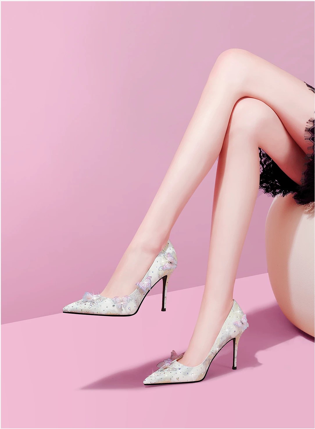
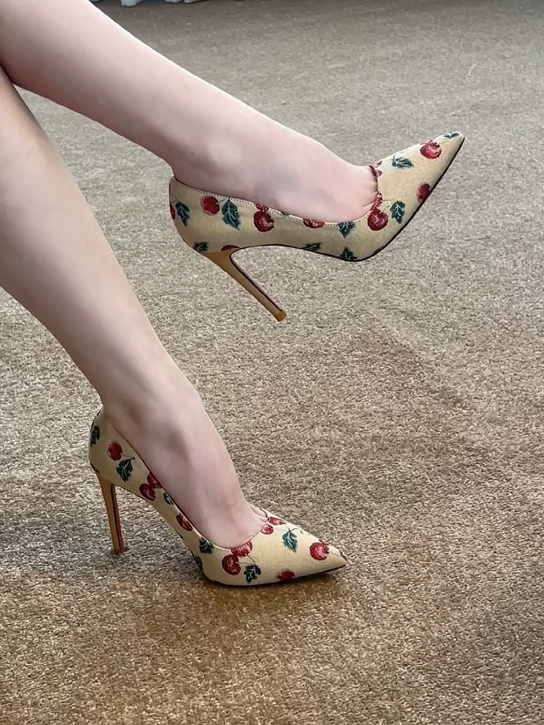
If you want a starting point rather than a theory, this pink pair with the soft finish sits in the lighter, less saturated zone, which makes it much easier to wear than a hot pink. The cherry print pointed pair is the louder option, and it works because the color and the print are doing one job together instead of two.
Browse the full range of women’s shoes by color if neither of those is your shade. The point isn’t these two pairs. It’s that the color you’ll wear is the color that already lives in your wardrobe, and everything else is a souvenir.
Buy one pair, wear them with two outfits you already like, and see if the third outfit suggests itself. If it does, you bought well. If it doesn’t, you learned something cheap.
